Protagonist Clothing Design (inc. Colour Theory)
(all work done on this page is my own)
Once the basic features of the main character were built, it was time to design her outfit. I began by creating a set of 8 different designs, ranging from ground, all the way to experimental and quirky. I wanted to create a wide range like this, as in the industry, the client will a broad range of options to select from. I created two types of outfit, the "client safe" approach, as well as creating some quirky and nonconventional ones, as the client may see the quirky designs that they hadn't previously thought about and actually like them more than the original idea. That being said there are still designs to choose from if they do not like the other designs with my own input into them.
That being said, I actually did like the designs of my character that were more grounded and realistic. I chose the 3 favourites that I felt complimented the characters personality. I picked 3 and went back into them, cleaned up the line art and drew the character in these 3 outfits.
I was happy with how the outfits were looking but felt that I couldn't decide which outfit looked best while they were all monochrome, so I went back and added in base colours, trying to refer to my research to influence the colour palette.
Once the base colours were in I felt that the dress and shirt were the two best designs. I ended up choosing the skirt design, as it will flow when moving so will help give the impression of movement. Also, it will add a distinctive triangle shape into the design, helping convey Robyn's independence better.In addition, the shirt is very close to other designs I have done in previous modules, so wanted to create a character that looked different and posed a new challenge in this project.
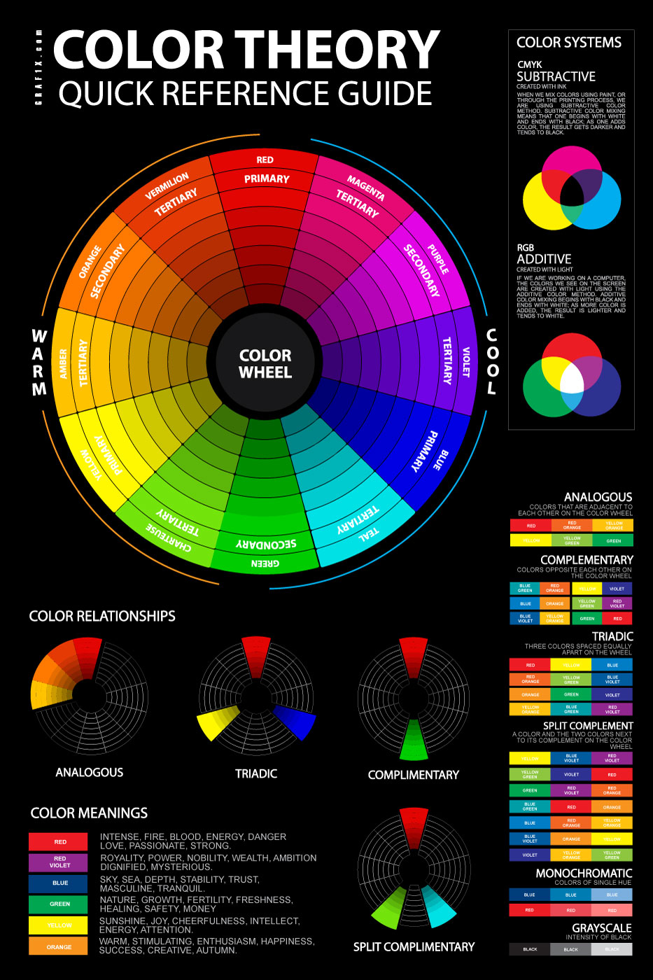
One the clothing design was decided one, I studied colour theory, as I felt the original base colours weren't all that compelling. I went back and created a series of concept pieces, 12 total, using different colour theories and palettes. I then posted a poll to my peers asking for their preferences. To my surprise, versions 6,8,9 and 10 were clear favourites, with many people steering clearing of a single colour for the dress. Upon review, having the dress two-tone does, in fact, help break up the figure and make her more visually appealing.
I ordered the top 4 in the level of popularity, left to right, and went back and shaded the dresses, to see if that would make much of a difference. To my surprise, the dress that was the clear winner the last round was far less popular when lighting and shading were applied, and in fact, The black and gold dress was the standout. I enquired as to why people liked the black and gold dress the most, with people citing that it looks formal, and the contrasting colours work well with each other. The yellow accent on the clothing helped give the character a formal yet inviting appearance to her. This suited my production aims, so taking this alternate perspective. I took this design and developed it EVEN further.
I went back and made some final tweaks to the colours of the dress, such as changing the hue of the shoes, skirt and black top. When I was doing that, I felt that the legs were perhaps missing something, and needed something to break up the large area of skin. To do this is added some tights and thigh high stockings. And as usual, I asked for peer feedback, a unanimous vote towards the thigh high socks, with only 1 vote going to the other choices. Satisfied with the results of the polls, I had finished the design of the character after some 32 designs.
Here is the final rendition of the final character design, who i had finally named Robyn! I chose the name Robyn as i felt that it fit the characters kind and independant name quite nicely. I had other ideas and suggestions, but many of the suggestions were soiled by people who had given the name a bad reputation.
During this design process i learnt several things about fashion design, as well as colour theory and the impact of shading on a character. I am glad that i did as many different designs as i did, and just didn't stick with the first idea that came to my head, especially considering that a wide range of ideas and an open mind to feedback and critical analysis is favoured in the industry that i want to enter.


Comments
Post a Comment