Identifying Technical Approaches & Character Design Theory

Fundamentals of Character Design
Character Design is a crucial element of when it comes to a characters likability, personality, and believability. I want to research the fundamentals of what makes an effective Character design.
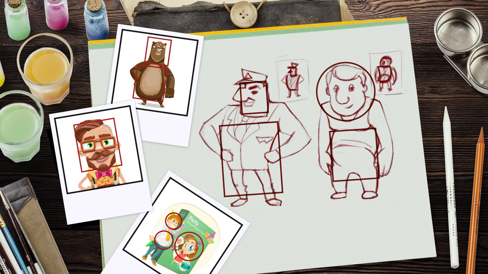
Shape plays a very important role in defining a character, the 3 most commonly used shapes that are used to build a characters personality and silhouette are squares, ovals, and triangles. Squares are often associated with stability, heaviness, and scale. In professional practice, these shapes are most common in masculine characters. If the character is not a macho/hero, the designer may use square shapes in his body too, to project his solid, stable and maybe a stubborn personality. Other qualities often assigned to a character’s personality, because of their square shape are dependability and confidence.
Characters designed with ovals and circles, often have no hard edges and are seemingly harmless, safe and or friendly. Soft angles are often seen in nature in often harmless creatures, such as cats, babies and so on, so our mind often immediately associates such fundamentals with such.
Triangles have hard sharp edges, and much like in nature, are associated with danger, villains will often sport this shape in their designs. Triangles also give direction. In contrast to squares, where we have only 2 directions-vertical and horizontal, here we have 3. Besides using them for portraying horrifying character’s personality, artists also use them to show a hero’s determination, drive, and opportunism.
 |
| *example of work, not my own. |
By mixing these shapes into a characters design is a good help for helping create more complex and interesting characters. A strong and stable (square) with a soft edge to them (oval) is just one of many, many examples.


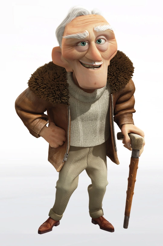
Good Examples of work in the industry that uses this technique are the characters in up, Russel being made with ovals, Carl with squares and the antagonist being made of triangles.
Size of these shapes can help give a character a distinct silhouette and help make a character design really stand out, however, this will require you to depart from realism, which is something you may be trying to achieve.
Another fundamental of Character is using not over cluttering your character in details. It is good for your character to have a visual focal point on them, using colour, shape, and details to direct the eye to a resting place. Characters that are too cluttered, or are just a single colour will really struggle with such a task.

 *
**Examples of "Bad Character Design"
Equipment Used
All Equipment researched and used is industry standard equipment and relevant to my practice.
ToonBoom Harmony: Toon boom is great for 2D animation, with its timeline function, onion skin, layers, and brushes. However, some of the illustrative functions are lacking in other programs. Allows for alterations in FPS.
Photoshop CS6: Photoshop is good for photo manipulation and 2D Illustration. It will be good for creating photo bashes for quick concept art. It also has more layer options and better brush tools than Toonboom, however, has little to no Animation Functions.
Premiere Pro: Premiere will the program used to edit my Animatic, add sound design, and export the final render of the Animation.
After Effects: While this program has abilities I intend to make use of, the program is mainly used for motion graphics. Such things will come into use in Post-Production of the Animatic.
CLIP STUDIO PAINT: CSP offers the best of ToonBoom with the best of Photoshop, it has a huge archive of illustrative tools, perhaps more so than photoshop, with nearly all the abilities that ToonBoom has to offer, including the timeline, onion skins, and FPS alterations. Whatsmore, all work on CSP can be saved as PSD's, Harmony files and even can encode its own animations and work for render, although that part of the programs is somewhat lacking. This means that any work is done in CSP, or any work done outside of the program can be opened and worked on in CSP. Clip studio is employed by many productions studios, such as AG, WIT studios amongst others.
Why NOT ToonBoom Harmony?
I have chosen to do most of my work in Clip Studio paint as opposed to its industry competitor toonboom. The reason for this is that the toon boom lacks in its illustration capabilities, and therefore would limit my ability to draw my character. Clip studio paint doesn't limit these abilities so it will be easier to create dynamic scenes and characters expressions that I would otherwise struggle to produce in toonboom.
Cinematography
Camera Angle Examples:

High Angle
.

Low Angle

Dutch Angle

Worms Eye

Bird Eye
Colour Palette in Animation:
(Source: Kubo and two string)
Target Audience
While I was researching industry practices, I felt that it would important to research my target audience, and what they are likely to watch, and why. I will then set myself some aims for which to meet with my character designs.
Example 1: The Legend of Korra (Nickelodeon)

The Legend of Korra's primary demographic is teens to young adults. It uses bright colours, and exaggerated features, while keeping characters with relatively realistic proportions. It does this to give a sense of excitement and adventure, and the character designs are done in such a way to help character convey emotion effectively.

Character designs often use various shapes to help convey a person's personality.

It also employs colour theory and the use of semiotics to help convey the mood of the scene.
Example 2: Attack on Titan (WIT studios)

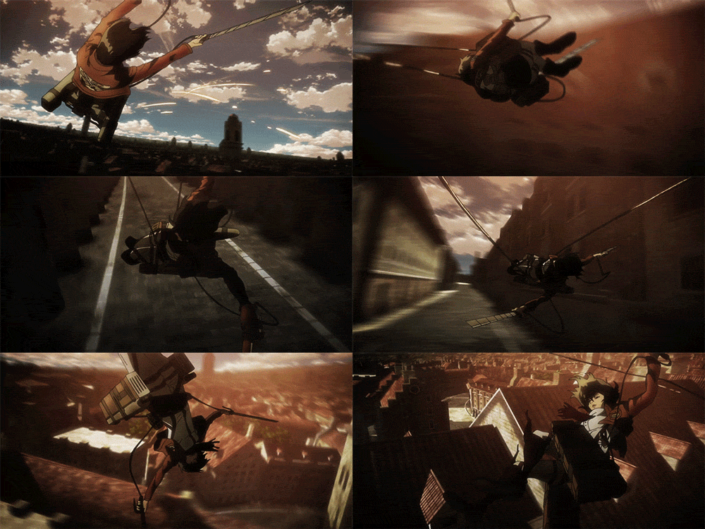
The Target demographic for Attack on Titan is elder teens and young adults. It isn't afraid to hide from more adult themes, such as war, loss, grief and racism. It uses a bright but often muted colour palette, so as to reflectively help convey the mood of the scene effectively.
Characters have a good fundamental in realism and anatomy, again, with some exaggerated features and distinct colour palettes to help differentiate the characters from one another.

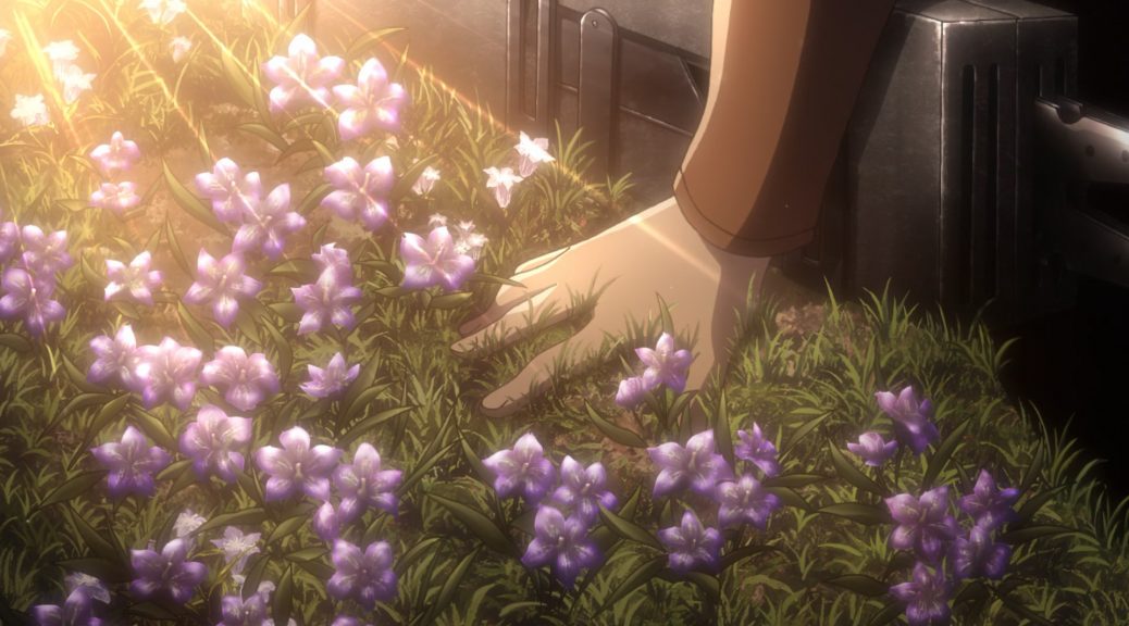
The colour palette plays a large role in setting the mood of the scene. Using evening and morning light to help add weight and depth to a scene.

The use of semiotics is well utilised in the series, with a lot of emphasis on visual metaphors to help drive the underlying themes of the narrative home. I feel that because of this, the narrative of Attack on Titan is compelling and strong as of a result.
Target Audience Criteria
Having analysed contemporary works that are aimed at my desired target audience, I have been able to create a list of production aims that I hope to achieve over the course of this module.
- A vibrant colour palette, both in my character designs, but also the environments around them.
-Characters that are believable and based in reality
- Some exaggerated features, such as eyes. to help convey a characters emotion and personality
- Use Semiotics, design and colour theory when designing my characters
- Exaggerate characters size to help differentiate them from one another.
I can use these production aims to refer back to when creating my character designs.


Comments
Post a Comment